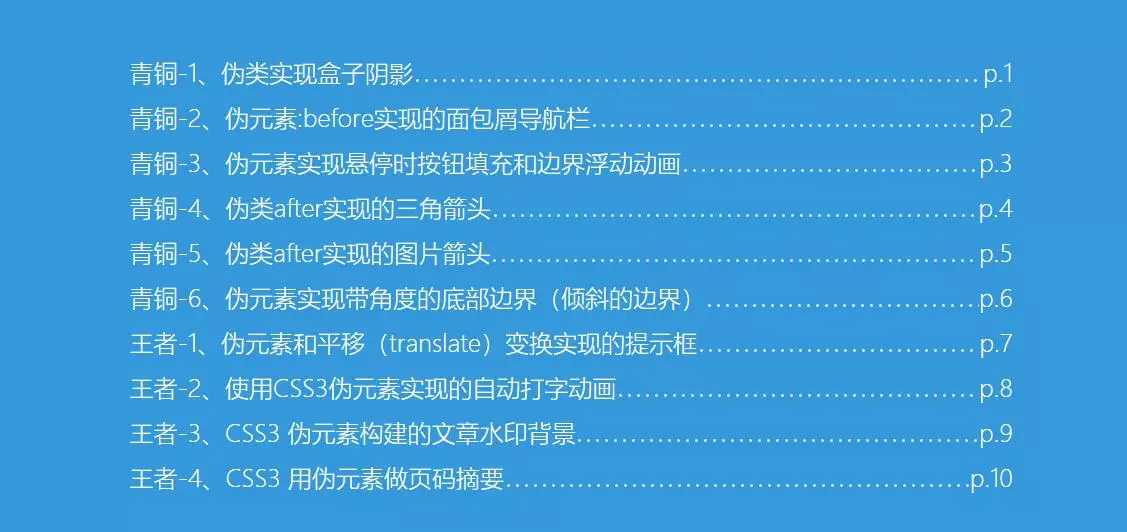
1 | 作者:codercao |
伪类经常与伪元素混淆,伪元素的效果类似于通过添加一个实际的元素才能达到,而伪类的效果类似于通过添加一个实际的类来达到。实际上css3为了区分两者,已经明确规定了伪类用一个冒号来表示,而伪元素则用两个冒号来表示。伪类与伪元素的本质区别就是是否抽象创造了新元素。具体的伪类和伪元素相关知识本文就不深入,下面介绍一下从青铜到王者10个css3伪类使用技巧和运用。直击案例代码
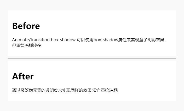
青铜-1、伪类实现盒子阴影
众所周知,Animate/transition box-shadow 可以使用box-shadow属性来实现盒子阴影效果,但repaint消耗较多,于是这里提出通过修改伪元素的透明度来实现盒子阴影
实现原理:
通过改变透明度,这样从一个非默认值更新它的值,就不需要承担任何重绘(参见:https://csstriggers.com/opacity)
(ps:貌似莫名的解锁了一个关于前端css优化,坏笑坏笑)
这里设置一个空的伪元素设置阴影透明度为0隐藏,再通过鼠标悬停恢复它的透明度,下面是传统和伪类实现的代码对比
1 | <div class="before"> |
1 | .before { |
效果:(完整代码见后文链接)
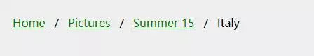
青铜-2、伪元素:before实现的面包屑导航栏
1 | <ul class="breadcrumb"> |
1 | ul.breadcrumb { |
效果:
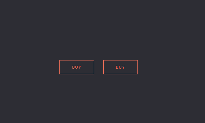
青铜-3、伪元素实现悬停时按钮填充和边界浮动动画
效果:(完整代码见后文链接)
青铜-4、伪类after实现的三角箭头
实现原理:三边设置边框,箭头指向的那个方向的border不用设置,位于箭头两边的边框颜色为透明(transparent),对边为主体边框颜色(较大的)/主体背景颜色(较小的),因为我们要有边框颜色的三角箭头,当第一个箭头(较大的)被第二个箭头(较小的)通过准确覆盖之后剩下没被覆盖的边缘就是合成三角箭头的边框了,其颜色就是较大的那个三角箭头的颜色,可调。而较小的那个三角箭头的颜色要设置成主体颜色,进行负值定位偏移时要把主体边框盖住,从而与主体合在一起了
1 | <div class='container'> |
1 | .arrow-left:before { |
效果:(完整代码见后文链接)
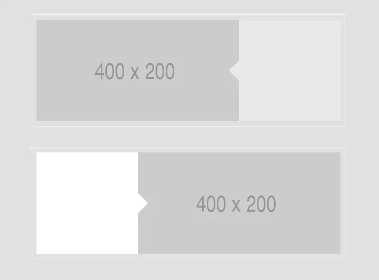
青铜-5、伪类after实现的图片箭头
效果:(完整代码见后文链接)

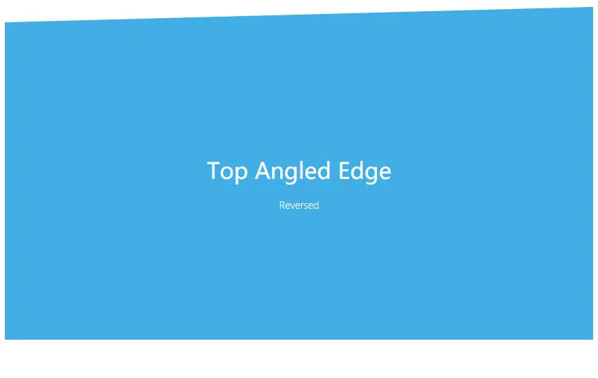
青铜-6、伪元素实现带角度的底部边界(倾斜的边界)
原理:修改webkit-transform: skewY属性来修改倾斜度(旋转也是一样的道理)
1 | .edge--bottom { |
效果:(完整代码见本文结尾链接)
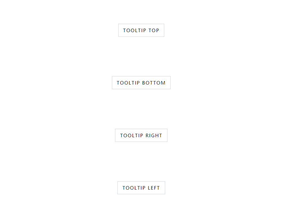
王者-1、伪元素和平移(translate)变换实现的提示框
1 | <div class="row"> |
1 | .tooltip .tooltip-content::after { |
效果:(完整代码见本文结尾链接)
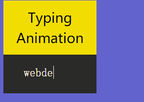
王者-2、使用CSS3伪元素实现的自动打字动画
原理:Typing Animation with Pseudo-Elements 看起来是打字,其实是使用伪元素覆盖在字符串上,然后逐渐减少伪元素覆盖宽度来实现的视觉效果
1 | <div> |
1 | .tagline-skill_inner:after { |
效果:(完整代码见本文结尾链接)
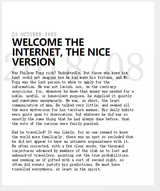
王者-3、CSS3 伪元素构建的文章水印背景
1 | h1 { |
效果:(完整代码见本文结尾链接)
王者-4、CSS3 用伪元素做页码摘要
1 | a { |
效果:(完整代码见本文结尾链接)
王者-5、伪类兼容性了解一下
1、IE8不支持CSS3中很多特性,比如伪元素nth-child,可以使用+号(代表相邻元素)来实现相同功能
2、Google的IE9.js是解决IE5.5到IE8 CSS3特性兼容性问题的JS库
最后
CSS的世界很美好,每个知识点都可以值得深入研究和实践,对于伪类、伪元素也有很多土味特效可以写出来,比如说图片遮罩、图片背景模糊,更多高级的鼠标经过事件特效等等,上边的10个案例是我个人工作上总结和参考踏得网上资源整理,希望对大家有所帮助
最后附上github示例源码,可下载体验。